Threshold Standards for the VLE?

Durham Conference blog post, part 3

As promised, here’s the last blog post from Durham, but in some ways the most controversial. There was a panel debate at the end of the first day on whether institutions should impose a minimum standard on VLE provision. To put it in Lincoln terms do students have a right to expect that certain things should be provided on Blackboard?  This is an issue that raises its head from time to time, and on the face of it one might think it was uncontroversial. (Students are paying fees, are they not? Why shouldn’t they expect some material to be provided through what is, effectively, the major student learning portal.).

For me though these things aren’t quite so simple. I do accept that students do have a right to a basic institutional information set, but there’s a debate to be had about what it should contain. I’m a lot less comfortable with the notion that every module, across all disciplines and at both undergraduate and postgraduate level should be denied the freedom to use a technology in whatever way those teaching the module think most appropriate. My second objection to a minimum standard of teaching information is that it is very likely to be highly didactic effectively saying “This is what you must do to pass this module.”Lincoln’s strategy is to cast the student as a producer of their own learning. While that clearly involves providing students with spaces to learn in, and access to resources, whether they be text based, digital, or specialised equipment, it also involves providing the opportunity to make, show, and perhaps most importantly of all discuss their work. I’m not sure that VLE’s are really set up for that as I said in a post a few weeks ago. Not yet, anyway.

Anyway, that’s enough about my views – how did the debate go.?  Well, right at the beginning, we had a vote on whether we should have a minimum standard, and the results were
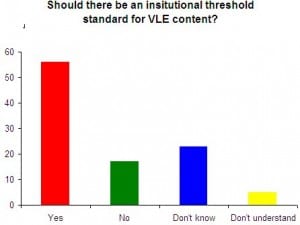
First vote
Results at beginning of session

YES – 56%

NO – 17%

DON’T KNOW – 23%

DON’T UNDERSTAND THE QUESTION – 5%


(Actually, the preferred term is threshold standard rather than minimum standards, the idea being that users will progress beyond the threshold, rather than work to the minimum).

In some respects this debate is a reflection of the success of the VLE. Many of the early adopters were seen as being rather adventurous, pushing the boundaries of what could be done with technology. Nowadays though, VLEs , and learning technology are commonplace, and while I don’t want to over – generalise, students are generally much more familiar with learning technologies, which implies that there would be a demand for technology based learning even if fees had not been introduced. The environment they grew up in and are familiar with happens to be technology rich. Certainly, as one of the panellists suggested, it’s a good idea to try and look at the VLE through students’ eyes. I haven’t conducted any sort of survey into this, but I strongly suspect that most educational developers prefer to see themselves as having a quality enhancement role, rather than a quality assurance role. Enhancement, to be effective, must involve the views of the users, which takes us back to the Student as Producer strategy.

Some contributors suggested that the commonest complaint from students were not so much about content, but about inconsistencies in design and structure. That, as one panellist pointed out was a real problem for joint honours students. The general feeling of the meeting was that this is best solved by involving students in the design but at a course or departmental level, rather than an institutional level, which would go some way to alleviating my objection that courses in say Fine Art, are profoundly different from courses in Computer Science and trying to impose a universal standard on both would be counter productive. (Although that still wouldn’t really help joint honours students)  It was suggested that departments could produce mutually acceptable templates for their Blackboard sites, which is a start, but still runs the risk of empty content areas. I’m not sure that’s a major issue. While we don’t mandate what staff do with their Blackboard sites at Lincoln, we do have a standard template for new sites, which staff are free to change. My feeling is that, while I have some reservations about the didactic nature of the template, it does work quite well, although I do think there’s scope for a small piece of internal research assessing how often colleagues depart from the template, or if they don’t which buttons are most used.

One audience member asked about standards in other technologies. I’m not sure that, other than computer use regulations, which are really about ensuring that an institution complies with legal requirements, they are that common. We don’t really mandate what colleagues can say in e-mail, or even what format emails should be sent in. Even if we did, we couldn’t enforce it, which is of course an issue for VLE provision too. The only real sanction is that poorly designed content posted on a VLE is likely to stay around much longer than a poorly delivered lecture, and be visible to colleagues) which ought to be an incentive for colleagues to concentrate on ensuring that such material was of the best possible quality.

A final objection to a threshold standard is that it requires a certain standard of competence from the users of the technology. University lecturers are primarily employed for their disciplinary expertise, and to a lesser extent for their pedagogical skill. Technological skill comes (at best) third, although you might argue that, in the current highly technological environment, digital literacy is as essential as, well, literacy. My own view is that most people’s digital literacy is pretty much adequate, although there are a minority who will always prefer to get someone else (usually an admin assistant) to post material on the VLE. That I think is where minimum and threshold standards have the potential to cause recruitment problems. As an institution we’d have to decide what were essential skills for working with technology, and ensure that we find people who had sufficient disciplinary, pedagogical and technological skills.

Interestingly when the vote was run again at the end of the session, the results were
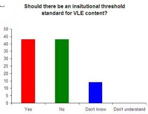
 

Vote at the end of the conference
Vote at the end of the session

YES – 43%

NO – 43%

DON’T KNOW – 14%

DON’T UNDERSTAND THE QUESTION – 0%


Which if nothing else, indicates that debating a topic improves understanding. At the end, everybody understood the question. More seriously, the debate was an excellent illustration of the problems associated with imposing standards on a highly diverse community. They’re a good idea until you have to conform to them yourself.


One last thing – there’s a much better summary of the debate available provided  by Matt Cornock, to whom many thanks.

All that remains for me to do is to thank the Learning Technologies team at Durham for organising an excellent conference, (which they always do!) and to recommend the conference to colleagues for next year. It’s always a good mix of academics and educational developers, and you get to see some really interesting practice from around the sector. I’ve been for the last four years now, and while I’m more than happy to keep my attendance record up, I’m beginning to feel a bit selfish about hogging it.


VLE data

First, I’d better come clean. This data isn’t mine – it’s from a publicly available spreadsheet produced by Matt Lingard, and you can get the full set at

and many thanks to him for doing that.
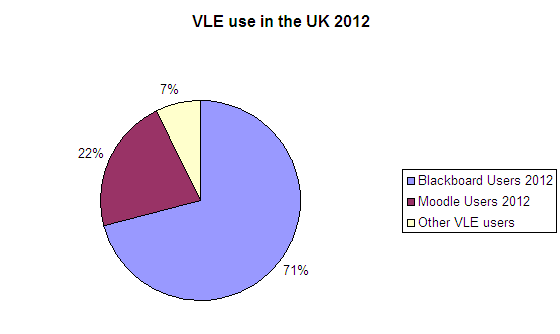
Following on from my last post, I thought it might be useful to get a sense of who was using what Virtual Learning Environment, (VLE) so I had a little play with Matt’s data, concentrating on UK Higher Education institutions only. (The full dataset does include some overseas institutions)  It seems that Blackboard is still the lead VLE in most UK Higher Education institutions. 

VLE Statistics United Kingdom Higher Education
VLE Statistics UK higher Education
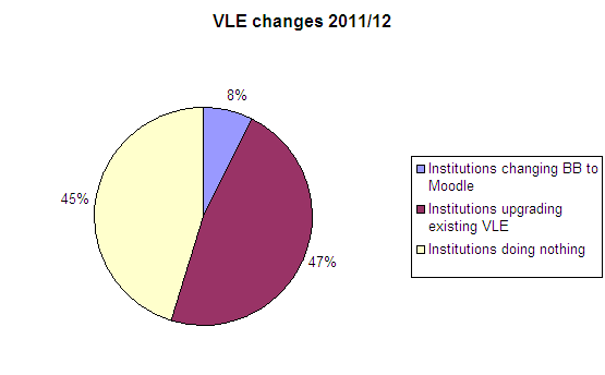
Apart from Blackboard and Moodle, no VLE is used by more than one institution. (The “other VLE users” in this graph use either something they developed in house, or other commercial products). Given the constant complaints about the high cost of Blackboard, something else I thought I might glean from Matt’s data was how many institutions are changing from one VLE to another (or planning to change – the spreadsheet simply comments on some individual cases, so it’s hard to see how far a change is confirmed). In effect, that means changing from Blackboard to Moodle, since as far as I can tell from the data no-one is planning to change to Blackboard from either Moodle, or one of the stand alone VLEs. Here are the figures.
UK Institutions planning to change Virtual Learning Environment
Planned changes to UK VLEs
I was quite surprised that relatively few institutions were planning a change, most preferring to upgrade their existing VLE. There are significantly new versions of both Blackboard and Moodle this year, so this would appear to have been a good opportunity to change, but most seem to have contented themselves with upgrading what they already have. (Also, the phrase “doing nothing” in the chart legend is a bit misleading, since many of the Blackboard users upgraded last year.) Of course, it may be that institutions are contractually tied to Blackboard, which is preventing them from changing until the contract expires. It would  be interesting to repeat this exercise over the next couple of years and see if there are any changes to this pattern.

The Politics of Blackboard.

We’re developing a bit of a tradition of “thinking aloud” here at Lincoln,meaning ruminating on an issue in a public forum, to kick start debates on research ideas, and this post is part of that. It shouldn’t be taken as a definitive proposal, just something that I’m thinking about.

Anyway, I’ve been reading a fascinating book on the Politics of Technology, (Harbers, (ed.), 2005) which contains a number of contributions arguing that non human technological artefacts have more agency than they are often given the credit for. Several of the contributors describe the political contradictions inherent in certain medical screening technologies. By “political” I mean dispositions of power – who really makes choices about how they act. One of the examples given is of a pregnancy screening test which alerts women to the likelihood of giving birth to a child with Down’s Syndrome. One the one hand,  that could be interpreted as giving pregnant women more freedom. They have the choice of terminating the pregnancy, or continuing with it, and preparing to care for a child that is likely to suffer from a severe disability. On the other hand there is an argument that the screening service itself makes it more likely that women will choose to terminate their pregnancies because by using words such as malformations and disorders in their research, the designers will have played a part in normalising “a society in which the chance of having a disabled child is no longer perceived as natural” (p234) That raises the question of the extent to which the technology (the test) has any agency of itself – surely it is the designers of the technology who give it agency.


There’s a little more to it than that of course – the test has to become routinely, or at least widely available, for such normalisation to occur. The fascinating question is how far is that agency co-opted by the different groups of users. In fact this particular chapter goes on to discuss how parliamentarians and medical professionals in the Netherlands took a very different view of how the test was to be used, but you’ll have to read the book for that discussion.


So what any of this has to do with Blackboard, or any learning technology. Well, it crossed my mind that a virtual learning environment shares some of the social characteristics of a medical technology. Effectively we’re designing something to facilitate something that other practitioners will use, and in the way we’re implementing it making implicit decisions about how it will be used. We decided for example to have a set of six default buttons on our Blackboard sites,

The default Blackboard site menu used at Lincoln
Default Blackboard Site menu

, thus normalising the idea that a learning experience requires “Announcements”,  “staff details”, “about”, “learning materials”, a “discussion group” and  “assessments”.  The really interesting question is why did we think this was appropriate? It certainly doesn’t match our “student as producer ” strategy as all of these (except the discussion board) have a rather didactic cast to them.


These are default settings, and instructors can amend them there was clearly a political dimension to the decision to set them in the way we did. It was based on what we understood as the way teaching went on in the university. But, if student as producer is to take off, then the future defaults might look like the illustration on the right.  (click both illustrations to open them in full)

A possible alternative default menu

Student as producer doesn’t remove the teacher from the process, rather renders learning a process of co-production (another theme running through the Harbers book). So we’d probably still want to provide a facility for making announcements (but we might want to allow students to do it too), we’d want to provide staff details, (and student details) and at a pinch a course handbook. We’d probably want to keep assessments too. But Learning Materials and the discussion board, might be replaced by a Wiki, and why shouldn’t there be buttons for public blogs and private reflective journals.


Also of course, this ignores a very important question. Why use a VLE at all. Blackboard, and other corporate providers are not without their critics. They’re expensive, can be restrictive (although I suppose that could, in theory, be mitigated by sensitive implementation). On the other hand, there are wide variations in the ability of university lecturers to cope with technology. (Among students too – I don’t really buy the “digital natives” idea). For all Blackboard’s faults, it does sort of “hold the hand” of those who are less confident with the technology.   There’s clearly a potential for some research here. How many of our own staff have gone beyond the default settings?  What do other institution’s default settings look like? How many of their staff have pushed those boundaries. How many would want to? I’ve been talking about Blackboard, but of course we, and many other institutions have staff who choose to use other systems, or none at all. Clearly this is too much for a single blog post, so I’ll no doubt be returning to this topic in future posts


HARBERS, H., 2005. Inside the politics of technology agency and normativity in the co-production of technology and society. Amsterdam: Amsterdam University Press.

Blackboard v Moodle (Part 2)

A few weeks ago I posted a comparison of what have become the two leading VLEs in UK higher education, namely Blackboard and Moodle. I don’t want to get into arguments about which is “best” here because any system is only ever as good as its users. We have some excellent Blackboard sites across the university that take full advantage of the available functionality, but that’s by no means universal.

However, a number of institutions are apparently moving from Blackboard to Moodle, ostensibly because of the much lower costs associated with the latter. However, it seems, according to members of the Association for Learning Technology, whose mailing list I follow, that the transition is not a simple one. (It’s a subscription only list, so I won’t post a link to the relevant postings). I quote: –

“We moved from Blackboard to Moodle just over a year ago and at that time there was no way of bringing material (courses, forum, documents etc.) into Moodle from Blackboard, I presume that is still the case I suspect that the two databases are just to different to map tables and content to each other in any meaningful way.”

A number of other contributors describe similar difficulties. What that means is that were we to move, every single Blackboard site would have to be recreated afresh. As another contributor to the list pointed out, that’s actually a good opportunity for an institution to review its e-learning provision. I’m not aware that Lincoln has any plans to move as yet, but we are committed to Blackboard until 2014. That’s still a significant amount of time, (Essentially it will see all our current undergraduates out.) but there’s a good case for beginning to think strategically about what we want to do now. If we do decide to change (and there are other VLEs that I haven’t mentioned here which we could consider), I suspect the transition is likely to take some time.

Blackboard upgrade. Should we go or should we stay?

We’re beginning to think about whether we should upgrade Lincoln’s implementation of Blackboard to the current release of the software. We’re currently using version 8, and Blackboard are now on version 9.1. I should stress that no decision has been taken yet, and this post is just the start of a longer process of reviewing and considering the relative advantages and disadvantages of such a move.

The question of whether to upgrade a piece of software, especially one that has a relatively large user community such as Blackboard is often tricky. It’s made more so by the fact that Blackboard is considered by many members of that community to be mission critical. Frankly I’m not so sure about that, but I’m prepared to accept that if many people believe it is, then, for them, it is. It’s going to take a long time to review this in full, but here are some preliminary thoughts. Most of this comes from reviewing what other users have said on the web site, and Blackboard’s own publicity material. There’s no substitute for diving in and getting one’s hands dirty, which I will be doing over the next couple of months.

One of the most compelling arguments for upgrading is that as software develops and the manufacturers bring out new versions, support for older versions diminishes. This is made worse when the software is delivered on-line, because web browsers too get updated and become incompatible with different versions of the software you’re trying to use. We’ve recently had one or two problems reported by users which we’ve managed to identify as being caused by this sort of thing. But when I say “one or two”, I do mean one or two – the numbers, so far anyway,  are still in single figures. Furthermore, we can’t really exert any control over what off campus users have on their computers. If they must use IE6 (for example), I don’t see what we can do about it – other than to strongly advise them to upgrade. It’s a fair bet that if Blackboard 8 is incompatible with an old browser, then Blackboard 9.1 won’t be either. I suppose having the latest version of both should provide a solution.

Which is all very well, but a powerful argument against upgrading is that people will be unfamiliar with the new version, and have to relearn their way around the interface. In this case, for instructors at least, the Blackboard 9.1 interface does look rather different. Blackboard themselves claim that the new interface is more streamlined, and easier to navigate. Well they would, wouldn’t they, although, it looks to me like the underlying architecture has not changed, so conceptually, it’s not all that different)

I’ve been having a look at 9.1 and I think these are the main differences:-

  • You can drag and drop modules around your front page, rather than use the rather ponderous dialog box that version 8 offers. I haven’t seen this functionality much used in version 8, but then, I don’t get to see what individual users have done with their front pages. But we don’t get many enquiries about it so I suspect most users are happy with the default provision.
  • It requires fewer clicks to accomplish common tasks. Again, that’s nice, and it was a bit irritating to have to click “submit” and then “OK”, to get something done. You might say that clicking two buttons instead of one hardly constitutes Stakhanovite labour, and I’d agree, but I have come across a few instances where people have not posted things that they thought they had. So that’s a plus point.
  • Blackboard claim that 9.1 has a more intuitive interface. Perhaps it is, if you’re starting from scratch, but most people will have learned the interface for 8 and thus will have to unlearn that first. Yet, it doesn’t look too demanding to me. The change that will have most impact on users,  I think,  is that you can switch “edit mode” on and off across the whole site, rather than having to turn it on in each individual content area.  In effect it looks as though it could be used as a default state for instructors and teaching assistants.   It also looks as though Blogs, wikis, tests, assignments etc are easier to create and integrated into the system (This may save us some money, as presumably we won’t have to pay for the Learning objects LX plug in which provides them now). I haven’t had chance to test this for myself yet though.
  • Again, I don’t know how true this is, but it seems that the Grade Centre functionality has been improved. Group assignments and and grading are now possible, but not having had the chance to create a dummy course yet I can’t really comment. There is also (they say, again, I haven’t tried this) the addition of Enhanced Feedback with VTBE (whatever THAT might be) for feedback and comments, grading of interactive tools; and also the ability to give feedback for tests, (which is in 8 isn’t it?) assignments, and group assignments. Finally they have enhanced My Grades Feedback so that provides students with the ability to view VTBE feedback from instructors in My Grades.
  • Multimeda such as YouTube videos and Flickr Photostreams can be more easily embedded into a site, although I need to check this there seems to be an embedded search tool built into Blackboard. Also Bb claim that videos have “built in, accessible controls” (Need to check what they mean by this.)
  • Another new feature is a course “Home page” allows users to easily see and navigate to newly posted materials. Currently, in version 8, most sites default to the Announcements page. (Although you can change this with the control panel). In 9.1 they default to this new home page, the content of which is controlled by the instructor.
  • The group tools look more sophisticated (now Groups tasks and Group Journal are available).
  • Looking at the web site they also claim that Blackboard Learn (what we call the Learning system is now integrated with Blackboard Connect (whatever that is) and interestingly suggest that Mobile Learn is included in BB9.1. We have had a few requests for this, but currently it is rather expensive, so it might be another plus point if we did go to Blackboard 9.1
  • Finally and importantly, Blackboard claim that 9.1 has been certified as accessible to visually impaired people, by the National Federation of the Blind (presumably in the US) to Gold level. I have no reason to doubt that, but again, we need to find out what that actually means.

Blackboard Midlands User Group meet. Part 2: The assessment handler.

As I mentioned in the previous post, Blackboard have developed a plug in to handle assessments based on institutional procedures for managing assessments, as opposed to a system that handles assessments the way Blackboard thinks they should be handled. It was designed in conjunction with Sheffield Hallam University, partly in response to the NSS findings about student dissatisfaction with the rate at which they received feedback on their assessments. The tool is an “add on” to versions 7, 8 and 9 so we could use it, were we prepared to pay for it.

The procedure for creating the assessment is much the same as it is now, except that there is another option in the drop down list on the action bar – in the demo version this was called SHU assessment, although if we were to use it we could call it what we liked. “Lincoln Assessment would seem favourite!  (This was in version 8 which we use – they didn’t show it in the new interface for version 9). Once  you have clicked the go button, you add the title, brief and attach any files much as you do now, but there are some additional features. You can describe the assignment as a “group” or an “individual” assignment, although I didn’t see that this gave any additional functionality beyond a description (Could be that they didn’t demo it). You also have the opportunity to designate a physical hand in point, so the tool can be used to record and publicise assignments, but you don’t have to submit them on-line. Quite why you couldn’t just write that in the description field wasn’t made clear. The really interesting bit was in a feature called the “file rename pattern”. Essentially this allows you to change the way the grade centre records the submissions. Most obviously it facilitates anonymous marking because you are asked if you want to alter the students name to say, an enrolment number. Of course anonymity here does depend rather on the institutional definition of anonymity, and there is an option to generate a random string of numbers. I asked if you could turn anonymity on and off at will, which would be a rather obvious weakness, but I have to say that my question was deflected (OK, they didn’t answer) and I didn’t get chance to pursue it as there were many other questions.  That’s an important issue though. The Turnitin Grademark feature offers a similar level of anonymity, but if an instructor attempts to turn it off, it does allow it, but they have to enter a reason why they’re turning it off, and they can’t then turn it back on again.

An additional feature, although one I didn’t quite see the point of was that you could set limits to the number of files that a student uploaded to any assessment, and you could also set a maximum disk size for assessments. I suppose that it would be useful if you’re trying to teach students to manage file sized properly (Which would be no bad thing, come to think of it), but I couldn’t help thinking you’d be making a bit of a rod for your own back if you have plenty of space.

Completing (i.e. submitting) the assignment is much as it is now, except that students now get a digital receipt for their submission via e-mail, which provoked a debate among delegates about how worthwhile this is. My own view is that it’s fine, provided students have the option to turn it off if they don’t want it.  There are a few extra tools for grading the assignment now. An instructor has the option to select files and download them into a zip file which also includes a spreadsheet with all the students’s details. Once the work has been marked the instructor can zip them back up, along with the spreadsheet, (into which marks have been entered) and re-upload them into the gradebook.  This sounds pretty much like what our computing department have been asking for for a while, so it may be worth investigating this tool further. (I wouldn’t put too much trust in a demonstration).

Blackboard Midlands User Group meet. Part 1:Version 9 or not?

Every so often Blackboard users from around the region meet up at one of the hosting institutions. This time I had a long journey to Birmingham University Medical School. (Only fair that I should travel though as Lincoln hosted the last one!). The format of these events is that each attending institution gives a brief update of what they’re doing, and then there’s usually a presentation from Blackboard about what they plan to do. Rather than give a chronological account, I thought I’d treat you to a few blog posts on the main issues. First up is the upgrade to Version 9, or rather the debate about whether we should go for it.

In summary I’d say the jury was still out, but appears to be moving to a majority verdict in favour. The most convincing arguments came from Northampton who admitted to some pain, but identified more positives, which were that their focus groups liked the version 9 interface, and they were getting positive feedback from their early adopters. Certainly, the presentation from Blackboard themselves on the Next Generation did give the impression that in the next release Blackboard would begin to look a bit more like a 21st Century e-learning product. I’ll discuss that shortly, but before I do I should run through some of the negatives. Northampton did admit that they had had as much as 7 hours downtime since the upgrade, but they have a hosted service (rather than running their own servers) and a lot of this had to do with a move of the data centre they were using. They also admitted that their Blackboard contact was very familiar with their server configuration, and this proved a great help. There were some reports from other institutions (albeit not represented at the meeting) that they had needed to updgrade their server confiiguration very rapidly in order to cope with version 9.

Leicester University also reported a problem with the upgrade to version 9 that proved a show stopper for them. Essentially it was that the wysiwyg editor didn’t respect font choices. This might sound relatively trivial, except that they had a number of departments who needed to use mathematical notation, but found themselves unable to use the symbol for pi. In contrast Dudley College, said that they had decided to abandon Blackboard and  switch to Moodle, but after testing the latter were planning to launch Blackboard 9 to all students at Easter.  Each organisation only had 5 minutes to talk so I never found out what the problem was with Moodle.  Interestingly, given the discussions we’ve been having at Lincoln Birmingham University is thinking about using version 9 as a student portal, but from the discussion it seems they’re not much further along that road than we are at Lincoln.

So what does Version 9 have to offer? Well the afternoon was taken up with a presentation from Blackboard staff in the USA (Birmingham has quite an impressive videoconferencing set up.) They were actually describing what Blackboard is calling the Next Generation. Of course, one has to be cautious about this kind of thing. Blackboard presentations always begin with a slide that has a lot in common with those voice overs on the Simpsons when they’re spoofing adverts. “Caution. Any images or promises in this presentation do not imply any connection with reality!” I’m exaggerating of course although not by much.

But, bearing that in mind, this is what they had to offer. The phrase they used was that these features are “targeted” at release 9.1 (not scheduled for it)

Bearing that in mind though there are also some interesting developments in functionality – “New” content types  – you can “add a page” and “add a file”. Essentially this seems to be a modification of the add item feature – a page can contain thumbnails of files, which can be stored either with the site or in the content store. If the file is a PDF it can be set to open on the same page.  Essentially it’s a wysiswyg editor, as now, but on a larger scale.
It shows a list of files associated with the site, which you can see as thumbnails, or in a traditional list view. Still needs the content system for full functionality.
The Edit view seems (on some pages) to have been replaced with a “build content” button which seems more intuitive.
A lot of the control panel functionality seems to have shifted to the side bar – you still have a control panel, but the links now open as sub menus (Not unlike the Windows file Explorer) The site map too opens in the side bar.
Each link in the site has a sub menu for things like adaptive release – in fact they  seemed to be roll-over menus. Rather than the four buttons we know each item has a set of sub menus
There’s an assign text book feature, which looks very like the old Amazon plug in
Learning module feature. Offers ability to organise information in a logical manner and then present that to studentes. Again, it’s basically a display of folders
Lesson plan feature. Certain parts of the lesson plan can be explained to the student, who sees information about the lesson, instructor objectives, content and practice questions. Instructors get lots of opportunity to identify (and add) metadata – again from a sub menu. Basically it seems to create a template for your own plans. Second part is allowing you to insert curriculum resources (e.g. learning materials, subject content etc.
Mash up. (Not really a mash-up) But they’re adding a feature by which you can easily import Flickr, Slideshare and Youtube data into Bb. You simply search (e.g.) You tube, preview, select it and then embed it. In the presentation this all seemed to work fairly simply.
There is also an add interactive/tool menu button. Seems that BB have now produced their own wiki tool Very detailed wiki stats are available – even to the level of detail of how many words have been modified on any given page by any given students. They’ve also added some grading functionality to the wiki. You can grade the wiki from within the wiki. True of blogs and journals as well.
Changes to grade center. Again accessible from control panel which is a sub menu on side bar. Can also search grade centre for different types of view. (e.g. Assignments, blogs, tests)
New feature will be the ability to grade anonymously. Also they’ve introduced the ability to grade by individual questions, rather than by students. (although if you do choose this latter option then you can still anonymise the students)
Question types chosen from within the questions (as opposed to selection the question type before you create a question) Again there seems to be a much nicer interface. BB weren’t able to say which

Bearing that in mind though there are also some interesting developments in functionality –There are  “New” content types. I’m not sure they’re all that new actually. For example they showed us that you can “add a page” and “add a file”. Essentially this seems to be a modification of the add item feature – a page can contain thumbnails of files, which can be stored either with the site or in the content store. If the file is a PDF it can be set to open on the same page. Admittedly it’s difficult to get an impression from a presentation but it seemed to me that they were basically offering a wysiswyg editor, as they are now, but with a rather better interface and the opportunity to separate files from items.

One feature I liked was that you can now see a list of files associated with the site, which you can see as thumbnails, or in a traditional list view. They said that this still needs the content system for full functionality, although in response to a question afterwards said it didn’t. It was getting late so I didn’t pursue that.

Another interesting development is that the Edit View hyperlink seems (on some pages) to have been replaced with a “build content” button which seems more intuitive. On other pages it had been replaced with an Edit button. I thought that a bit confusing but on reflection I suppose if you’ve started to build something, it is logical to go back and “edit” it

Much of the control panel functionality seems to have shifted to the side bar – you still have a control panel, but the links now open as sub menus (Not unlike the Windows file Explorer) The site map too opens in the side bar, again something that is long overdue. I did wonder about accessibility as inevitably the font size is rather small.

Each link in the site has a sub menu for things like adaptive release – in fact they  seemed to be roll-over menus which expanded. Rather than the four buttons we know each item has a set of sub menus so rather than go to an adaptive release page, you’d roll over the link and various aspects of adaptive release are displayed – time constraints, user visibility conditions and so forth. A lot of this approach had been taken to the learning module feature, which had been given something of a makeover, in that it had a much more logical structure.

There’s an assign text book feature, which looks very like the old Amazon plug in

They’ve also added a “Lesson plan” feature. Certain parts of the lesson plan can be explained to the student, who sees information about the lesson, instructor objectives, content and practice questions. Instructors get lots of opportunity to identify (and add) metadata – again from a sub menu. Basically it seems to create a template for your own plans. There’s a second part to it which allows instructors  insert curriculum resources (e.g. learning materials, subject content etc. making it quite hard to distinguish from a learning module.

Of course, few corporations can see a bandwagon without wanting to jump aboard, so we now have Blackboard “Mash-ups” Actually they’re not really mash-ups except in so far as they show data from other sources. Instructors can easily import Flickr, Slideshare and Youtube data into Bb. You simply search (e.g.) You tube, preview, select it and then embed it. In the presentation this all seemed to work fairly simply.

There is also an add interactive/tool menu button. It seems that BB have now produced their own wiki tool. It looks different from the learning objects wikis but they seemed most anxious to show us the eye boggling level of detail including how many words have been modified on any given page by any given students. They’ve also added some grading functionality to the wiki. You can grade the wiki from within the wiki. True of blogs and journals as well.

There have also been some changes to grade center. Again accessible from control panel which is a sub menu on side bar. Can also search the grade centre for different types of assessements  (e.g. Assignments, blogs, tests). Another new feature is the ability to grade anonymously. Also they’ve introduced the ability to grade by individual questions, rather than by students. (although if you do choose this latter option then you can still anonymise the students). Question types  are now chosen from within the questions (as opposed to having to select the question type before you created it)

That’s a bit of a gallop through their presentation and I may not have done it full justice. But there’s a lot else to go through, and I’ve already broken my rule about 100o words per post. Future posts on this topic (In the next day or so if I get time) will look at the “assessment handler” a new plug in for managing assessments that is configurable to reflect an institutions procedures, and a second post about some of the issues that were raised in the discussion.

Prettifying the reading list.

I am indebted to my colleague Paul Stainthorp for this ingenious mash up of Refworks and Amazon to create something that almost (but not exactly) resembles the old Amazon reading list plug in we used for Blackboard. The plug in used to show bibliographic details and an image of the book cover making reading lists a bit more interesting. The user could click on the image and buy the book from Amazon, or follow a link to the library catalogue (assuming the site owner had put one in). Unfortunately when we upgraded to Bb version 8 the plug in stopped working as the developers hadn’t offered an upgrade

Well the mash up goes one better in that the book title is linked to the library catalogue, and it also offers links to a Refworks folder, Librarything, Google Books and Amazon (but of course!) I should say here  it’s not simple to do – and the method described here is local to the University of Lincoln.  But in the interests of remembering how to do it, I thought I’d set out the method here. Couple of things to remember before you start. You will need a Yahoo Pipes account, and you will need to know your way around Refworks. You also need to have instructor or Teaching Assistant rights on Blackboard.

1) Go to your Blackboard site and click the Refworks Bridge tool (You’ll find it under the Site Tools menu)

2) Create a Refworks account linked to Blackboard (N.B. This will not be synchronised with your main Refworks account) (Need to put instructions about this here) (You only have to do this once – that is not for every site in which you are an instructor. If you’ve already done this ignore this step)

3) Set up a shared folder in the BB refworks account.

4) Add the books to the shared folder. You could use the Refworks Ref-grab-it tool to get the data from Amazon to do this. In fact it is a good idea to do so because the pipe will be calling the ISBN from Amazon in order to display the image.

5) Share your Refworks folder. Ensure that the show RSS feeds check box is ticked and select “50 Most Recently Added References” from the create RSS feeds drop-down box.

6)DO NOT forget to give your folder a Title.

7) Click the URL in the shared folder display, and right click the RSS feed icon. Select “copy shortcut” from the sub menu. (if you’re using IE7 – if you’re using Google Chrome it will say “Copy Link Address”

7 Leave this window open, open a new one and go to Yahoo Pipes

6) If you haven’t already got one create an account for yourself on Yahoo Pipes. If you have, log in to it

7) Search Pipes for “pstainthorp”

8.) select “University of Lincoln Library Booklist”

9) Paste the URL of your shared folder into the Refworks RSS feed and click the “Run Pipe” button

10) Your reading list will be displayed. But you haven’t finished yet. Oh no.

11) Right click the Get as RSS Icon and select “copy shortcut” from the sub menu.

12) Go to the content area of your Blackboard site where you want the reading list to be displayed.

13 Go to Edit View and add external link. Paste the RSS feed you’ve just copied into the URL box.

14) Give the external link a title, and add any comments.

15) Click Submit.

And that is it!

The single document format debate

Last year, we introduced Blackboard at Lincoln, and, whatever your views on the merits, or otherwise of virtual learning environments, the functionality it is providing is definitely leading to an increase in interest in on-line submission of assessment. This is also an issue for exportability in e-portfolio development. (Just so I can keep the blog on theme!) If you want to make sure documents can be easily exported from one e-portfolio system to another, then I think it’s sensible to try and standardise your document formats. (Of course, this all depends on the type of documents you want to store in your portfolio)

But the submission of assignments issue presents a problem. Students don’t all use Microsoft Word 2003, which is still the University’s preferred word processing platform. So they’re submitting in Word 2007 (and a variety of other exotica that lurk out there on the net.). The result is of course that tutors can’t read these strange files when they download the files to mark them.

So, one suggestion, is that the university should move to insisting on submission in PDF format. Broadly, I think that’s a sensible approach, (although it’s not a solution). For all the talk we hear of digital natives, students aren’t all as tech savvy as they’re sometimes portrayed. And unless you’re on campus, or willing to pay for a PDF converter for your personal PC, it’s not so easy to do.

Anyway, my point is, if you want to convert documents to PDF, I’ve just discovered some useful (and free!) tools to do it. Here’s the link.

Blackboard Conference Barcelona, April 2009


Having been packed off to Barcelona for the annual Blackboard conference I thought it useful to provide a brief report. I do have much more extensive notes if anyone wants them, but I have come to the conclusion that brevity is the soul of blogging so I am going to try and keep this down to no more than 1000 words. If you want more leave your e-mail address and your question as a comment!


Having had a few days to reflect I think I identified four themes to the discussions which were


1) National and international attitudes to education.

2) Content.

3) Community

4) Not Blackboard.


Firstly there was a remarkable degree of optimism from the keynote speakers, about the value that national governments were placing on higher education.  A very interesting statistic about the benefits of investment in education came from Dirk van Damme from the OECD who drew our attention to the fact that in the 1950s South Korea and Ghana were at the same level of economic development, which is patently not the case any more. Of course there may be more factors than simply investing in education at play here but the point is that it is possible for countries to change their prospects. He also pointed out that we in the west were nowhere near the participation levels of some countries which had managed to get 80% of their population into HE. What the consequences of this might be were still unforeseen. We don’t know what effect the tripling of the number of graduates might have on social indicators such as crime, health, and welfare.


He also suggested that the main threat to universities was not private providers, along the lines of Microsoft’s Hamburger University, but the direct assessment of skills by employers. How long would it be before they realised they did not need a separate institution to certify their abilities – which of course rather undermined his last point about the social implications of expanding the numbers of graduates.  For those who would like more information about this and about what the OECD are doing about it. have a look at http://www.oecd.org/edu/ceri


The second theme of the conference was what I have called Content – by which I mean new features of Blackboard, or interesting plug -ins. The first of these was something called Waypoint, which is a plug in for managing assessment and more accurately feedback. It is being used at Bournemouth University who had a policy on a 3 week turnaround for assignments (just like us!) Waypoint can either manage the

whole assessment process online or be adapted to work with paper submissions. Essentially academics create an online block of assessment criteria, sample comments etc that go to form the feedback. (sounds a bit like Turnitin’s Grademark feature to me). These criteria are then grouped together into assignments and can be shared between academics. However individual comments may be added to provide feedback

and it does allow double and blind marking. While it sounds impressive, it does require a bit of effort to learn the software, and it does cost $9000 p.a.


Waypoint is a plug in provided by a separate company, but Blackboard themselves have a few new products on the point of release. There is a communication system called “ConnectED” which will enable Blackboard users to send text messages to students, as well as offering a choice of other communication methods, although there are some regulatory hurdles to be overcome before they can release it in Europe. They’ve also entered into a strategic relationship with Wimba to make Wimba Pronto (an instant messaging service) available for free. I thought the most interesting announcement though was that they are planning to open up the content store so that users can make their content available to users in other institutions. Michael Chasen, Blackboard’s CEO claimed that Blackboard stored more content than Facebook, and that this was rather a waste of resources. (If true, I’m inclined to agree!) There is no suggestion of going “open access” rather that there will be an extra level to the content store which will be accessible by any Blackboard users, although of course the content creator would still need to have given permission for such access.


That of course leads us into the third theme – community. Blackboard see themselves very much as a community of users and spent a lot of time plugging the developer and “Behind the Blackboard” Communities. They’ve also developed an API for Blackboard 9 which allows other LMSs to be incorporated – e.g. Links to Moodle, Sakai etc. Directly from course list on BB home page. They are also thinking about pushing content out of Bb e,g to Facebook. (BB9 has an interface already.) The point is that the authentication problems go away because the Facebook user is told that there is a new item in their Blackboard course, but they still have to log into to find out what it is. Iphone and Ipod touch fans may also be interested to know that there is now a BB app available for these gadgets.


Finally I was struck in the various paper presentations that I attended by the number of presenters who were talking about things they were doing with social networks such as Elgg, and Ning (But not Facebook, Heaven Forfend!) rather than Blackboard per se. There was quite an encouraging “edupunk” feel to some of these papers, that is that there was very much a DIY attitude to educational technology.  As one presenter put it, we want to get away from the traditional lecture model, but that doesn’t mean we just give lectures in the pub. In other words we don’t just move over to Facebook, because the students don’t want us there, just as they don’t want us in the pub. But we do create useful spaces, and there was a very encouraging use of tools such as Ning and Elgg, to encourage students to contribute work in different formats and to collaborate with each other.


Clearly 1000 words isn’t enough to do full justice to the conference so I may return with posts on more specific topics at a later date.


Note: For some reason this post has attracted a torrent of automated spam. I’ve therefore turned commenting on te post off. Sorry about that, although in reality, I doubt any genuine commenter will want to say anything 3 years after the event.