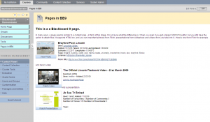
As I promised a couple of days ago, I said that I’d continue to review Blackboard 9.1 to help us make our decision on whether to upgrade. I said in my last post on the subject that 9.1 was not all that different from 8 in terms of its underlying architecture, and while I broadly stick by that, there is one new development that may have considerable potential to enhance the student experience of using BB. This is the “page”. Basically the instructors in a site will have the ability to create a much more “designed” site. Each page is linked to by a menu button, so that every topic in a course can have its own page. Blackboard have also provide subheaders so that course menus can be structured much more like a menu on a web page.
We shouldn’t get too carried away about this – Apart from the subheaders you could do this in Blackboard 8, if you’re prepared to limit each content area to one or two items, but for people who are used to building web pages, it may be a little more intuitive. (although of course, it has nowhere the near the full flexibility of HTML coding)
Another feature I quite like, is what Blackboard refer to (inaccurately) as “mashups”. What they mean is that you can search Flickr, Slideshare and Youtube from within the page (or content area) editor and link to material from those services – which are streamed directly from the appropriate service rather than stored on Blackboard. It also displays metadata from the hosting service. You might think this will be a licensing nightmare, but since you’re not actually copying the picture, and you are displaying attribution, I suspect it might be less of a problem than downloading and re-uploading content. Anyway here’s a picture with some examples
 |
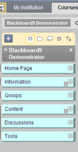
One thing that did puzzle me a bit at first was how to add a button in BB9. If you’re used to 8 you know you have to go into the menu manager, accessible through the control panel. In 9 however, this is simplified because they’ve simply added an icon to the menu itself – which you only see if you’re in edit mode.

The other buttons across the top of the menu control the way in which the menu appears – It can appear as a site map in the position where the buttons are, or, much as in version 8, as a navigable map in a separate window. What the illustration doesn’t show is that they’ve also simplified the control panel somewhat, which now appears as a set of expandable menus below the main site buttons. Which is nice in one way, but you have to expand all of them, if you can’t remember where the particular tool you need is!
I think the new look control panel may be the topic of my next post.
You must be logged in to post a comment.